Trending

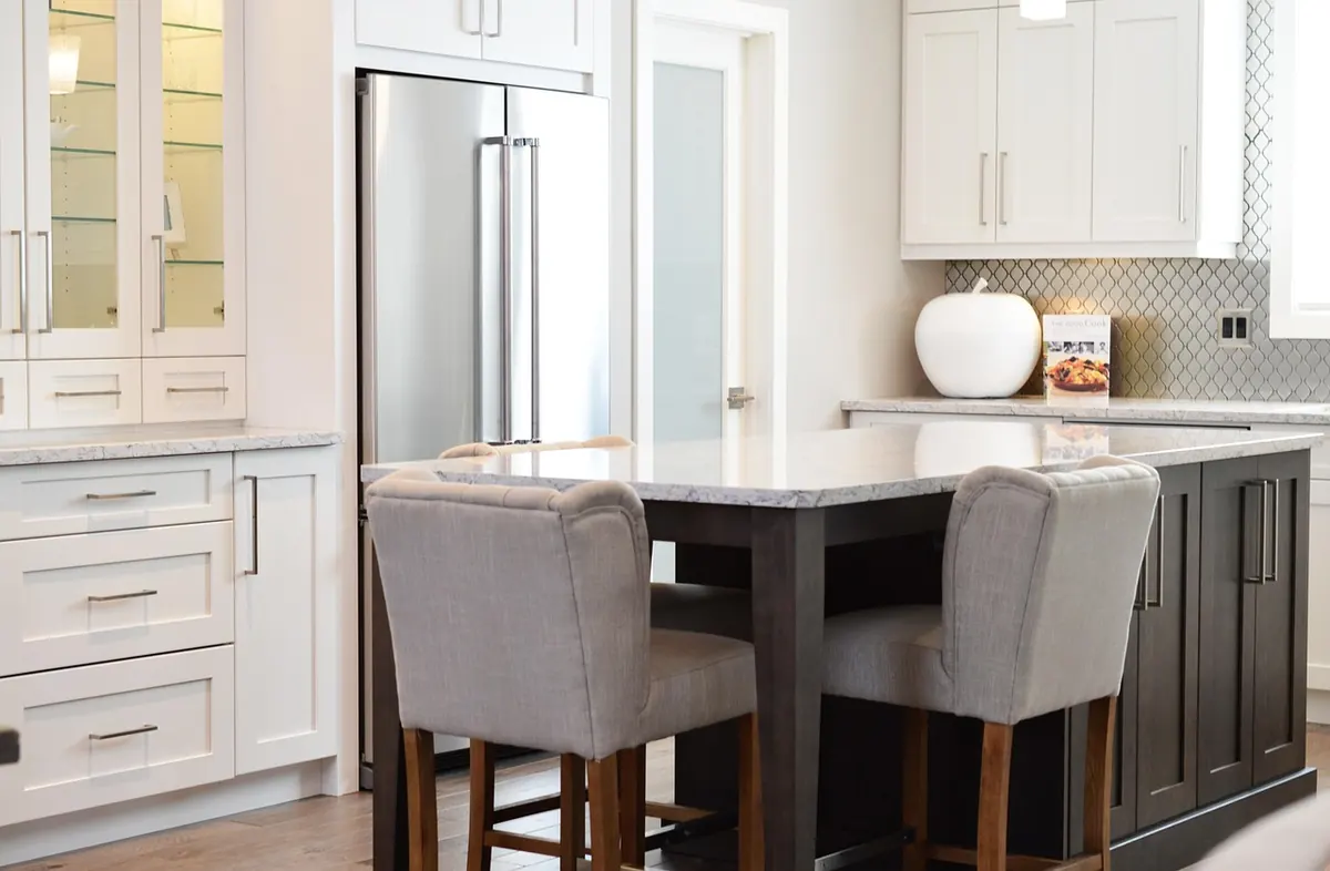
Open shelves are the hardest-working display space in a kitchen. They hold the plates you actually use, the cookbooks you actually read, and the mug that gets you through the morning. That is why they can look brilliant — or like a shelf in a lost property office. The difference is rarely money. It is a simple styling formula: ceramics, cookbooks, greenery and a healthy respect for negative space. Get those four elements working together and even a basic rental kitchen can feel considered, calm and quietly expensive.
Before you buy anything, empty the shelf and look at what you already own. Most of us have enough bowls, mugs, jars and books to make a decent display; we just pile them up instead of arranging them. A reliable formula is one vertical item, one organic item, one textural item and one empty space per shelf. The vertical might be a cookbook or a tall jar. The organic is a plant or a bowl of lemons. The textural is wood, linen, stoneware or glass. The empty space is what makes the rest visible. If every centimetre is filled, nothing stands out.
Think top to bottom.
Keep it light. A trailing plant, a single vase, a small stack of bowls. Avoid heavy items up high unless they are securely placed and you are confident they will not come down in a hurry.
This is the everyday shelf and the one people see first. Put the items you reach for most — mugs, plates, tea caddy, salt and pepper — into two or three clear groups. Leave a gap between them.
Go heavier. Chopping boards, larger jars, a stack of pasta bowls, a bread bin if it fits. This anchors the arrangement so the shelves do not look top-heavy.
Matching sets can look stiff. A mix of shapes and glazes feels more collected and more personal. Choose two or three colours that already appear in your kitchen — white, cream, soft blue, sage, terracotta — and stick to them. Then vary the finish. A matte mug next to a glossy bowl is more interesting than five identical beakers. Charity shops, car boot sales and supermarket basics are perfect for this. Look for plain, sturdy pieces without logos or novelty slogans. Stack bowls in threes. Turn mugs so handles face the same way, or alternate them if you prefer a looser look. Small details like this are what make a shelf look styled rather than stored.
Cookbooks are not just reading material. They are blocks of colour and height. Stand a few upright and stack two or three horizontally to create a riser for a small bowl or plant. Group them by spine colour if your collection allows — warm reds and oranges together, or blues and greens — or simply choose the ones with the calmest covers and store the rest in a cupboard. Do not overfill. Five or six books on a shelf is plenty; twenty will look like a jumble sale. If you use them often, keep the current favourites at the front and rotate the rest.
A little greenery makes a kitchen feel alive, but too many plants can look like a garden centre. One healthy plant per shelf is usually enough. Herbs in simple pots are practical and look good for a few weeks at a time; replace them when they fade. A trailing plant such as a pothos or string of hearts can soften the hard lines of a shelf, especially on a top tier where it can drape. If you are short on light, choose a dried eucalyptus stem or a small vase of rosemary. Keep pots plain — terracotta, white ceramic, woven baskets — so the plant, not the container, does the talking.
The biggest budget mistake is treating empty space as wasted space. It is not. Negative space is what gives the eye a rest and makes the objects you love look deliberate. Aim to leave around one-third of each shelf empty. That might mean a gap between a stack of plates and a jar, or a bare patch at one end. Resist the urge to fill it with a small ornament just because you have one. If a shelf feels crowded, remove one item and step back. Repeat until it looks calm. You can always bring something back later.
Open shelves have to survive real life: steam, grease, dust and the morning rush. If a shelf sits close to the hob, keep it for sturdy, wipeable items — jars, boards, metal tins — rather than delicate ceramics or fabric. Wash and dry items before they go back, and do a quick edit once a week. Remove anything that has become a dumping ground: keys, post, chargers, stray hair ties. A shelf that is easy to use is easier to keep looking good. And if you tire of the arrangement, change only one thing — a plant, a stack, a colour — rather than starting from scratch. Small adjustments keep the look fresh without spending a penny.
Photo: ErikaWittlieb / Pixabay