Trending

A north-facing room is often the one people apologise for. It stays cool in summer, holds shade all day, and by late afternoon in January it can feel as though the light has quietly given up. Yet north light is steady, gentle and surprisingly flattering to the right colours. The trick is to stop fighting it and start choosing paint that works with what the room actually receives.
Direct sun carries warmth. It lands on a wall and bounces back with yellow and red in it. North-facing rooms miss that entirely. Light arrives indirectly, filtered through the sky, and sky light has a blue bias. On a clear day the effect is at its coolest; on a flat grey day everything turns muted and slightly muddier still. That blue cast settles on your walls and mixes with whatever pigments are in the paint.
This is why a colour that looks warm and inviting on a south-facing wall can read grey, chalky or faintly green in the north-facing room next door. It isn't the paint being difficult. It's the light doing its job.
Every colour has an undertone: the second colour hiding beneath the first. Warm whites sit on yellow, cream, pink or red. Cool whites lean towards blue, grey or violet. In north light, cool undertones are amplified and warm ones are flattened, which is exactly why a sharp blue-grey that looked smart in the shop can feel cold and draining once it's on the wall.
The practical rule is to choose a colour one or two steps warmer than you think you want. A grey with a hint of green or brown will hold its own. A grey with a strong blue or violet undertone will double down on the chill.
Watch how the light shifts through the day, too. East or west sun may briefly clip the edges of a north room in the morning or evening, warming it, then leave it flat again. Sample at the hours you actually use the room, not just at midday.
Warm-leaning neutrals and earthy shades tend to do the heaviest lifting:
Don't overlook the deeper end of the spectrum. Rich, saturated colours give a north-facing room weight and warmth in the evening, and they hold their shape even when the light is thin. A dark green study or a navy bedroom in a north room feels considered rather than gloomy, because there is no glare to fight against. North light is consistent, and consistency suits bold choices.
Ice whites, blue-whites and cool greys are the usual suspects, along with anything a colour card describes as silver, lilac or dove. Pale cool blues and grey-teals can work if they lean green, but a true blue tends to sink into the shadows. Stark brilliant white deserves a rethink as well: next to the grey of north light it can look clinical, and a brilliant white ceiling can feel like a hole cut in the room. A soft off-white on the ceiling, a shade warmer than the walls, keeps everything connected.
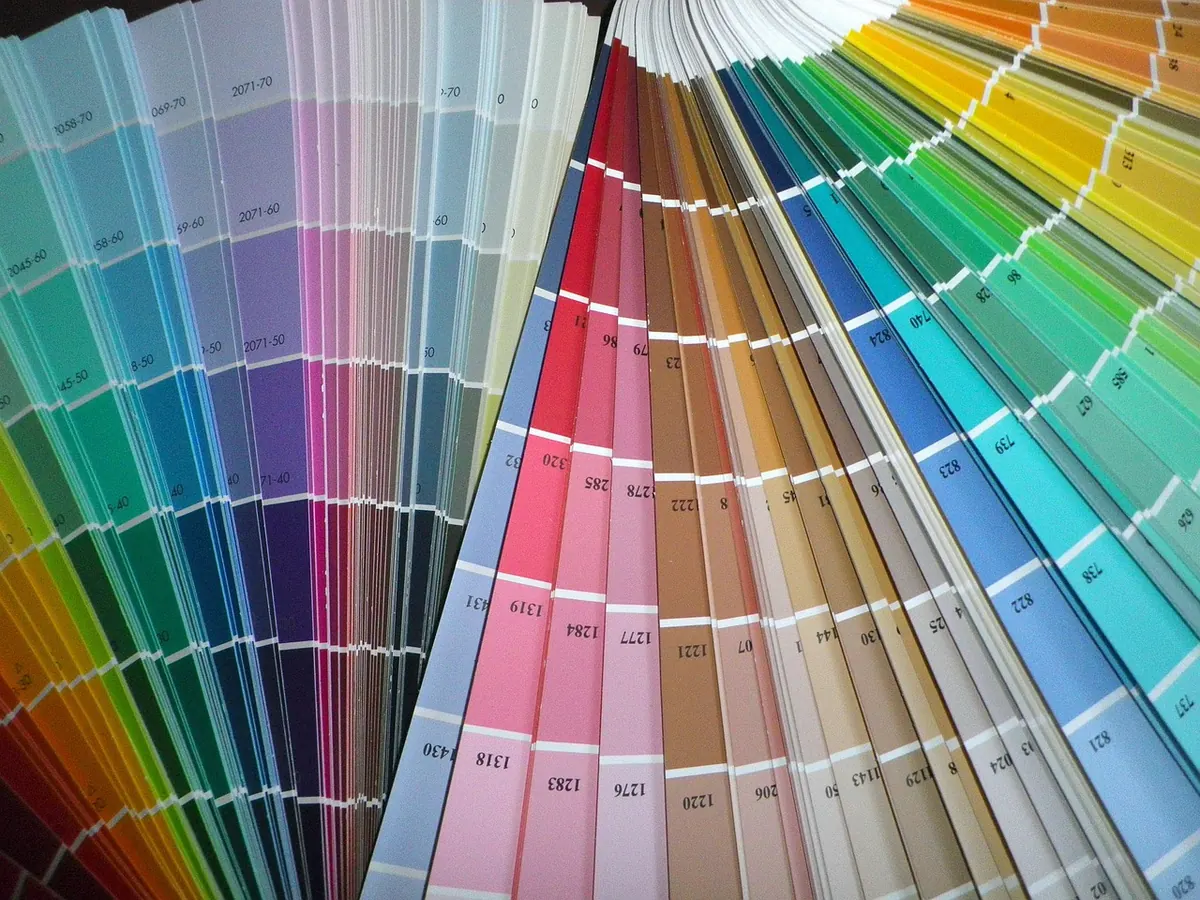
Colour cards are printed, not painted, so they only ever approximate. Tester pots are the only way to know. Used well, they save you the cost of repainting a whole room.
Avoid painting small squares straight onto the wall. The existing colour distorts your eye, the edges are hard to judge, and a patch near a window and a patch in a corner are effectively two different colours. Also remember that the sheen of a tester pot may not match the finish you eventually buy, and wet paint always looks different from dry.
Matt emulsion absorbs light, which flatters north-facing rooms and any uneven plaster, and gives the softest, warmest result. The trade-off is cleanability. In a living room or bedroom, standard matt is fine. In a hallway, or anywhere with children and pets, choose a durable or washable matt, which keeps the flat look but wipes down. Silk and soft sheen bounce more light back into the room, and that reflected light carries the cool cast with it, so walls can look greyer and every bump shows. Use higher sheen sparingly in a north room.
Water-based eggshell is the reliable middle ground: a soft sheen that is wipeable and less prone to the yellowing older oil-based paints are known for. Gloss reflects the most light and can read hard against cool light, so keep it for front doors or radiators if you like the look. Not every skirting board, door frame and window needs to be brilliant white; a warm off-white, or a colour related to the walls, ties the room together instead of chopping it up.
These need products made for steam and splashes, used exactly as the manufacturer instructs, with good ventilation while you work and between coats. A mid-sheen kitchen finish will reflect some cool light, so pick a warmer colour than you would in a matt bedroom paint.
Start with a warm-leaning neutral for the bulk of the walls, then test it properly before you commit. Choose one deeper or earthier colour for a chimney breast, alcove or the woodwork, which adds depth without darkening everything. Keep ceilings a soft off-white rather than a brilliant one.
Then do the other half of the job: layer the lighting. A mix of table lamps and a floor lamp on warm white bulbs, a mirror positioned to catch the window, and a few natural textures such as wool, linen or bare wood will lift the room far more than paint alone. North-facing rooms reward a little patience. Get the undertone right and the steadiness of that light stops being a problem and becomes the reason the room feels calm.
Photo: christilove / Pixabay